Colour and outdoor design: how to choose elegant and timeless palettes
Natural tones, measured contrasts and materials: a colour guide for contemporary outdoor spaces
Pubblicato il:
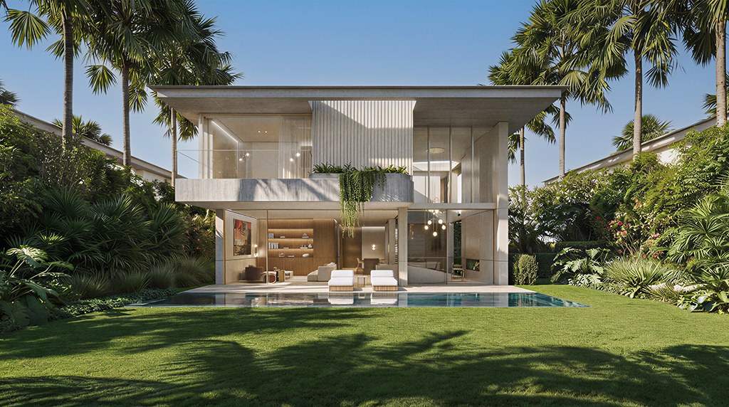
In the design of outdoor spaces, colour is never a purely aesthetic choice: it is a design element capable of defining atmosphere, perception of space and relationship with the landscape. In the contemporary outdoor design scene, the trend is oriented towards balanced palettes, designed to last over time and dialogue with materials and natural light.
A well-constructed palette always starts from the observation of the context. In urban environments, for example, neutral and sophisticated tones help to create a sense of visual continuity with the architecture. In more natural contexts, on the other hand, colors inspired by earth, stone and vegetation strengthen the connection with the environment. This approach reflects a key principle of outdoor design: to design spaces that evolve with the seasons without losing harmony.
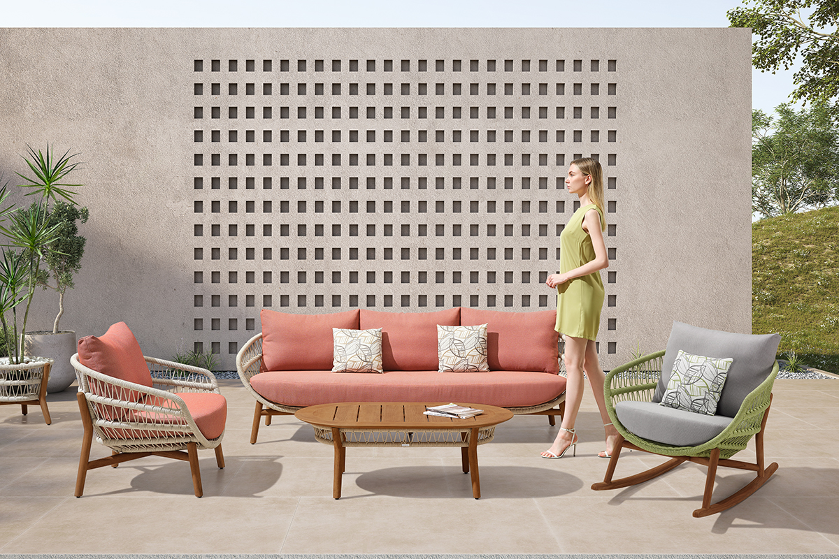
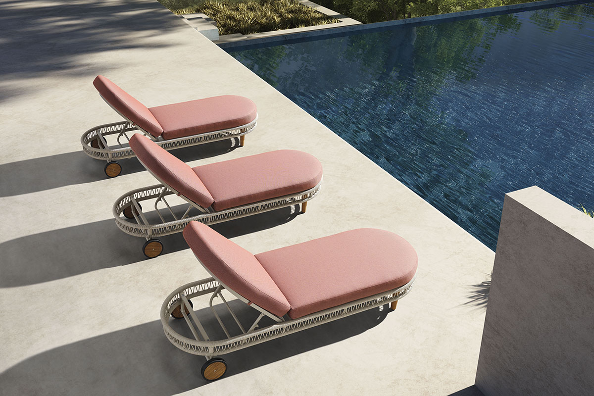
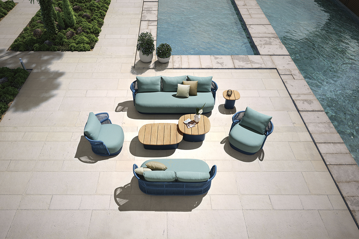
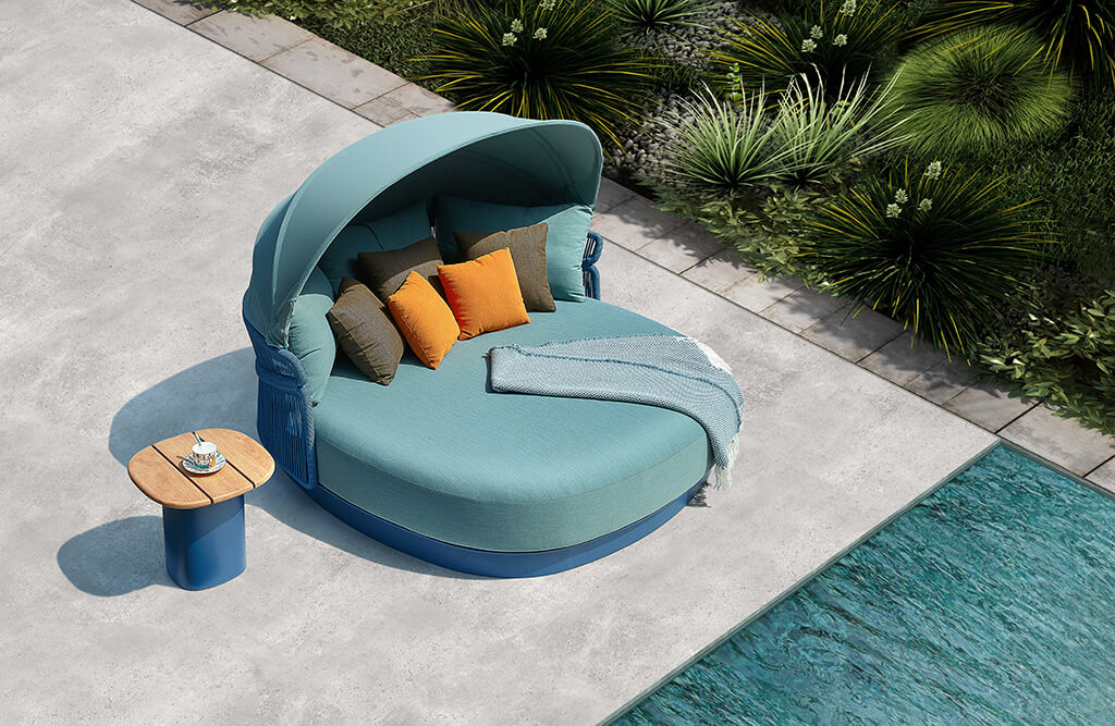
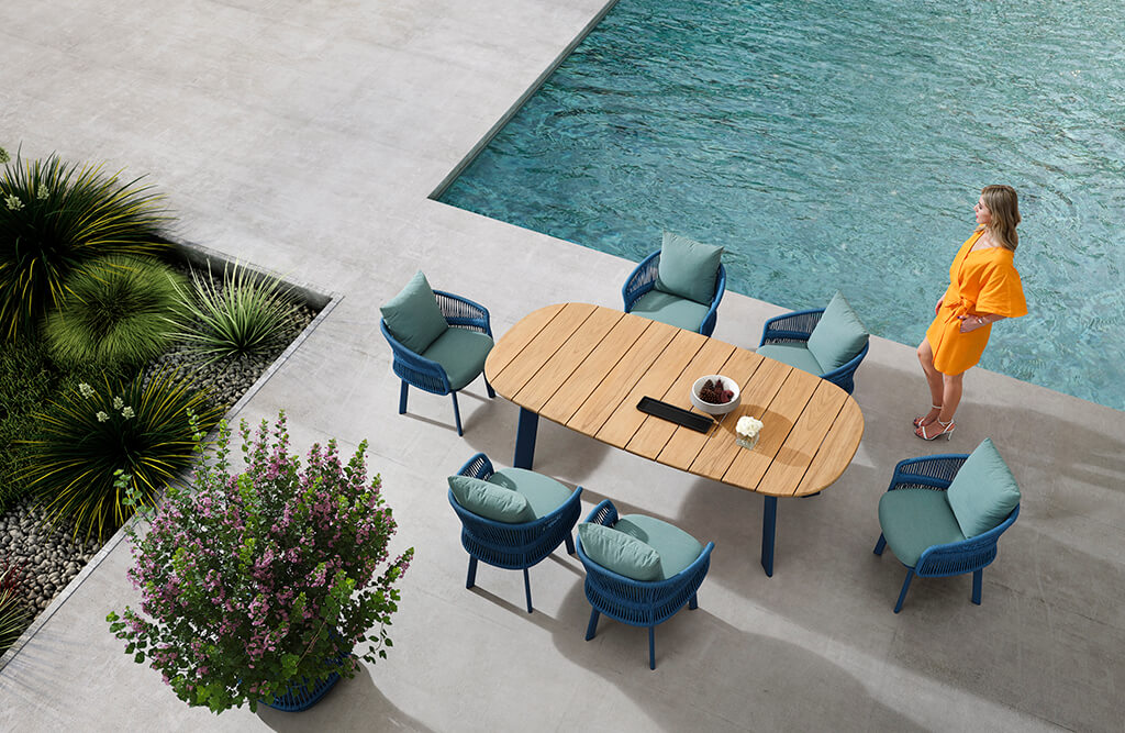
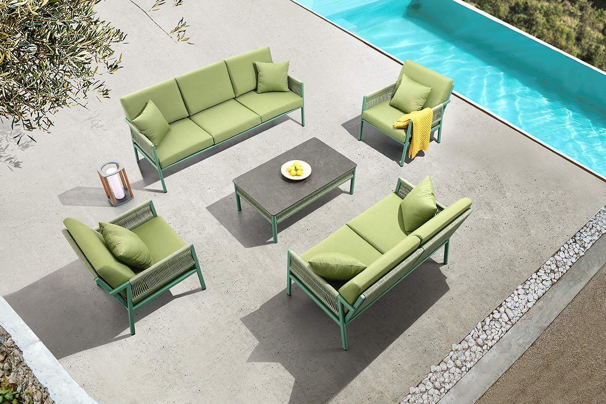
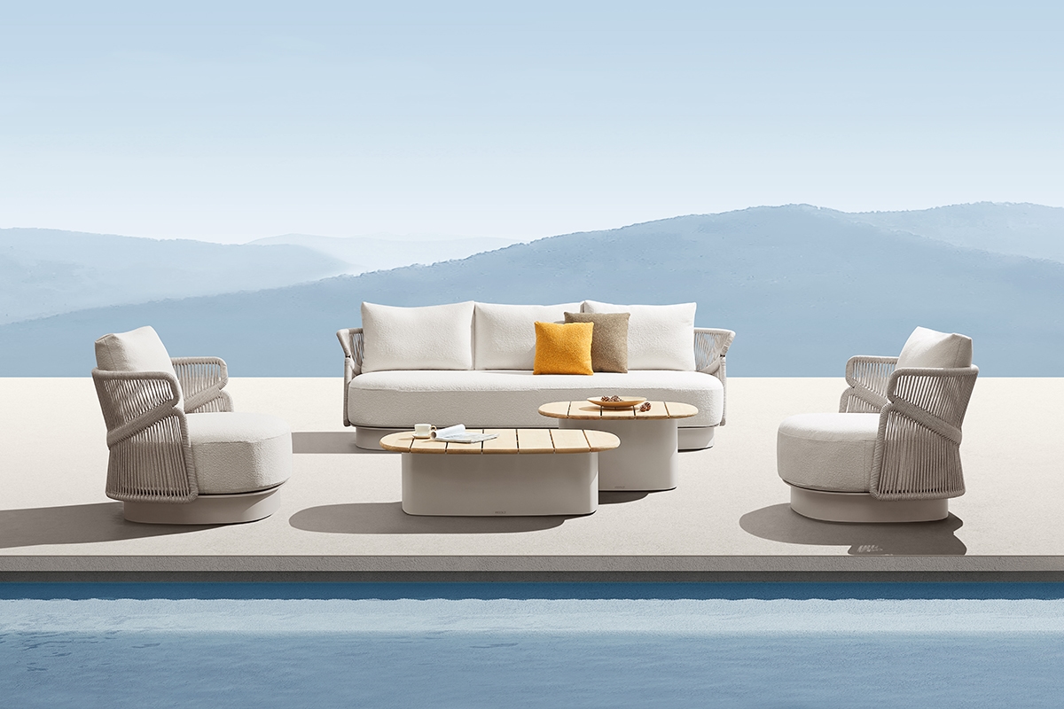
Among the most versatile choices are color ranges based on warm beiges, soft grays, and desaturated greens. These shades are the ideal basis for elegant outdoor furniture, because they allow you to add chromatic accents without weighing down the composition. Fabrics, cushions or decorative details can introduce more decisive touches, while maintaining an overall visual consistency.
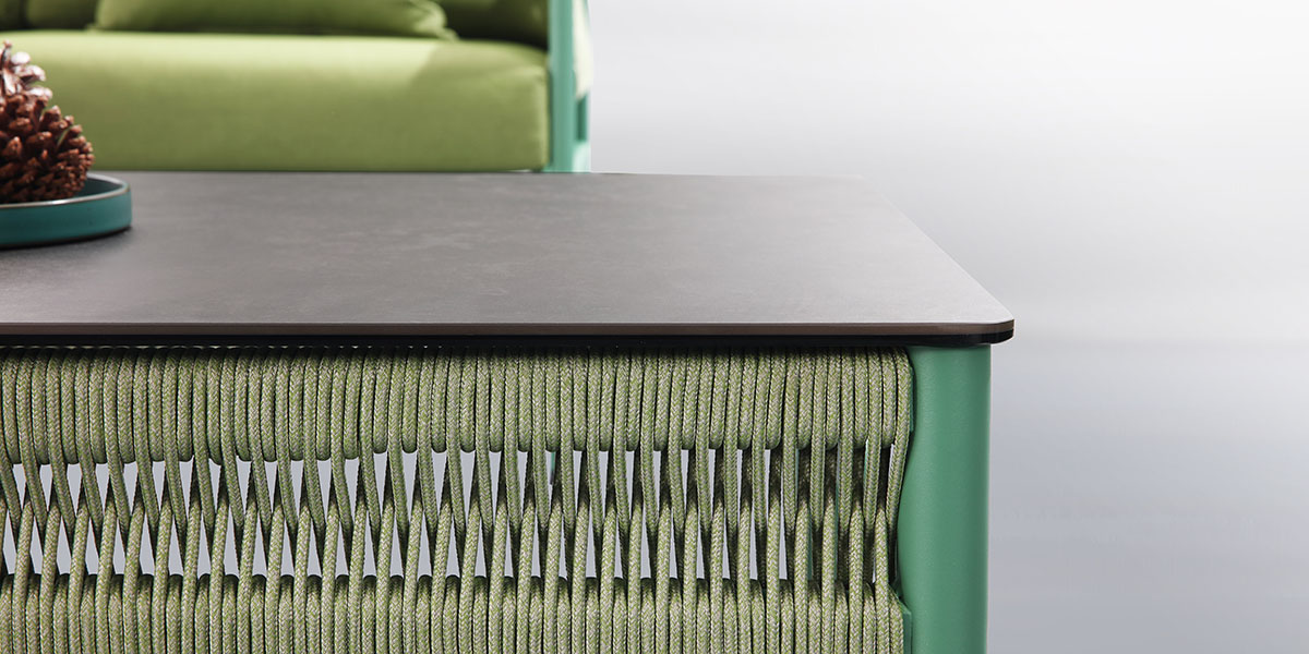
The relationship between colour and material is equally crucial. Matte surfaces, natural finishes and material textures absorb light differently than glossy surfaces, influencing colour perception. In the most recent projects, the research focuses on combinations that enhance the materiality of outdoor furniture, creating refined but welcoming spaces.
Galleria immagini
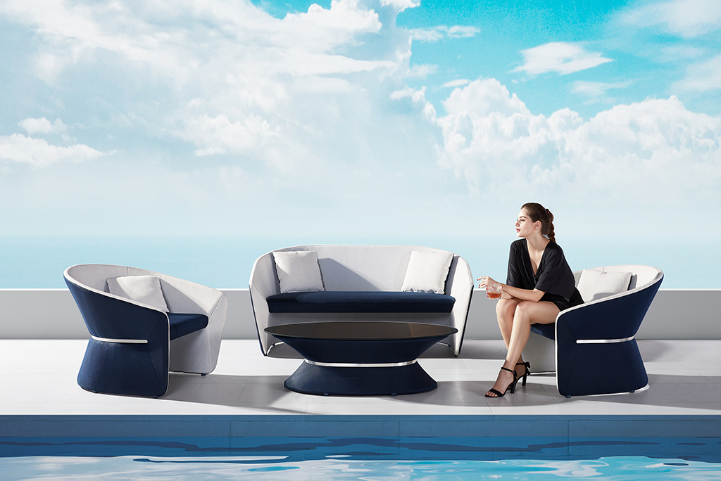
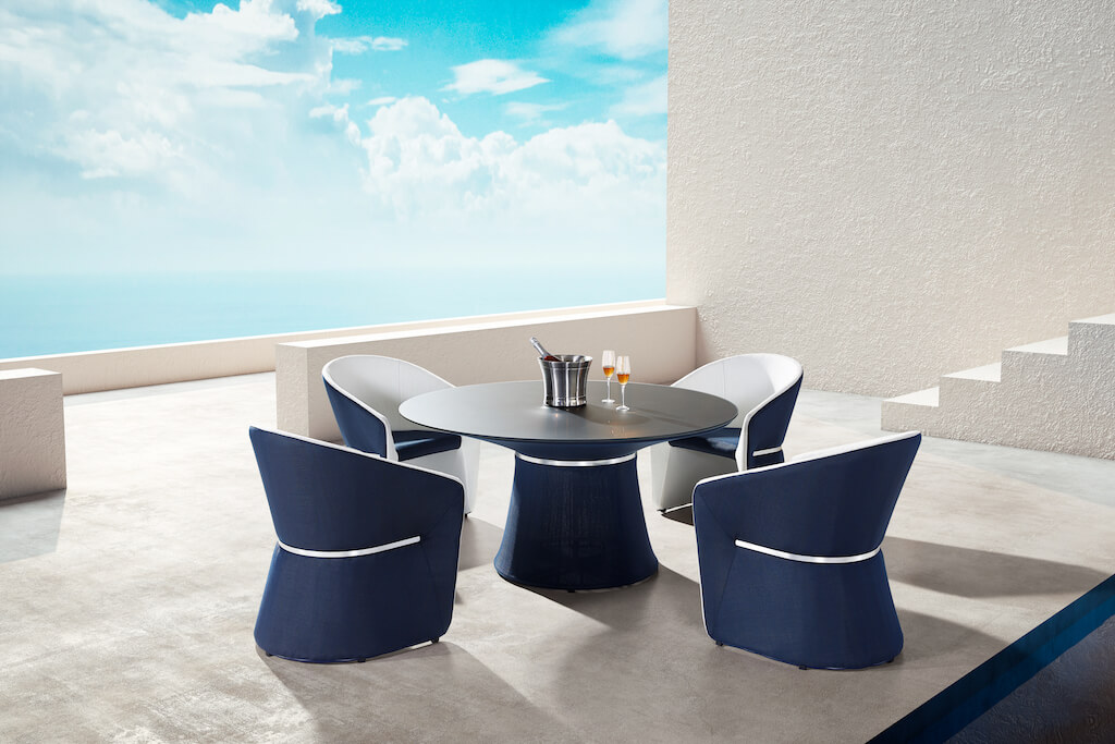
In this context, Higold Milano’s outdoor furniture collections also offer an interesting example of how color can dialogue with shapes and materials without being dominant. The proposed palettes often move on sober and contemporary tones, designed to be easily integrated into urban terraces, gardens and hospitality spaces, demonstrating how chromatic consistency is a central element in design.
Another fundamental aspect is the management of contrasts. Too sharp combinations risk making the space dated in time, while soft and progressive contrasts help to create visual depth. This principle is particularly important in landscape architecture projects, where color and natural light work together to define the experience of space.
The choice of a timeless palette also passes through the reduction of superfluous elements. Limiting the number of colours and focusing on similar shades allows you to obtain more balanced and relaxing environments, in line with the evolution of outdoor living towards an increasingly essential and sensory dimension.
Designing colour in outdoor spaces means finding a balance between aesthetics, context and durability. A conscious approach allows you to create environments that do not simply follow trends, but build a coherent and lasting visual identity.