Let's find out which are the most popular color choices and which materials to combine with the different colors
Pubblicato il:
Furnishing the bedroom with pastel colors is certainly a great idea to enjoy a relaxing atmosphere, ideal for the sleeping area. The softer shades are in fact preferable for the room in which we rest or allow ourselves healthy relaxation after a long day, perhaps reading a good book or watching a movie under the covers. Pastel is nothing more than the delicate variant of primary and secondary colors, and to create it, you just need to mix a bright color with white. And that’s how we get pink, blue, mint green, lilac, etc. Let’s find out with Carillo Home : what are the most popular color choices and which materials to combine with the different colors.
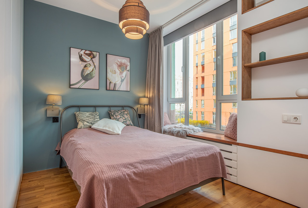
Pastel pink bedroom To get pastel pink, just mix red with white: depending on the type of red, you can get many variations of pink, from baby pink to powder pink. This color enhances the most romantic emotionality, especially suitable for a female audience who loves to show her sweetest and most sensual side. You can also mix several shades of pink together, so as not to be monotonous. Ideally, you should play with fabrics, from bedding to curtains and decorative pillows, combining pink with darker shades. The lighting should be naturally dim and light, so that you can appreciate the romantic side of this color. As for the furniture, you could place a pink velvet armchair and a powder pink wardrobe with a vaguely retro style. Pastel pink goes very well with shabby and modern environments.
Galleria immagini
Pastel green bedroom Pastel green (from sage green to mint green) is one of the most popular spring colors for its beneficial effects on mood. It goes perfectly with many colors, such as white, cream and beige, which can also serve as a neutral base of fabrics. The latest trend in furniture is also to combine green with pink and lilac. In combination with materials such as cotton and linen, pastel green conveys freshness and relaxation, reducing the negative tensions accumulated during the day. Mint green, in particular, goes well with luxury furnishings and accessories, making the most precious metals stand out and shine.
Pastel blue bedroom Shades that derive from light blue are very often combined with more intense colors, although it would be better to avoid playing with blue and red, unless you want a sailor-style room. Blue also lends itself very well to geometric and imaginative textures. If we mix it with neutral colors such as white, gray and ivory, we can achieve a very soft effect, which will make the environment extremely relaxing. Light blue, as well as pink and white, is also perfect for bed linen.
Ivory bedroom If you want to focus on something more elegant and neutral, to be combined with other pastel shades, it is ivory. The latter manages to give a harmonious appearance to the sleeping area, perfect especially for those who want to move away from the canonical white. Ivory has been greatly re-evaluated in furnishing trends, especially in the Provençal-inspired and shabby chic rooms. It can be combined with lilac, apricot and sage green, depending on the effect you want to give to the environment.
Among the furniture materials to be combined with pastel tones, wood undoubtedly stands out. Light wood is especially perfect with light blue and green, while dark wood is enhanced by apricot and pink. In fact, both pink and apricot are the most used pastel tones within a classic décor.