Here are some pointers to help you find the right way to work with colors
Pubblicato il:
When you are in desperate need to renovate your home, color is a significant concern that people find overwhelming. How do you do it and, above all, how do you do it correctly? Of course, you may not have any prior knowledge of interior design to deal with color, as the following guidance will help you find ways to work with colors.
So, without further ado, let’s get straight to the point.
Choose a color based on the feel you need Yellows and oranges are exciting, while reds are intense, blues are calming, and greens are energizing. Each color has a certain feeling that it evokes, and this is what you should go with to get the best selection for your home. Instapro.it and other sites know this all too well. Whatever feeling you want to have when you walk into that room should be the color you choose. Just do a little research and get a color.
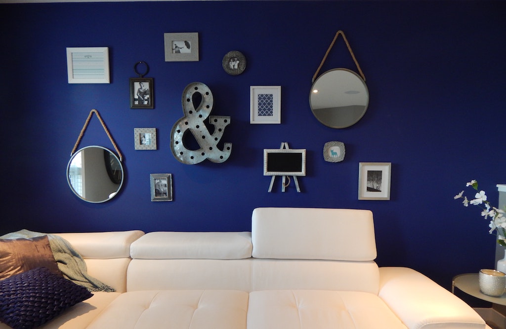
Use the 60-30-10 rule This rule involves the use of colors in interior design. 60 percent is the color that makes up the lead in your pallet. Thirty percent is the secondary color, and ten percent is the accent color that takes up only 10 percent of your space. You may wonder how to get the balance right, but there’s no need to worry; Here’s an easy way to do it. The sofa and carpet should have the primary color, the accent seat can be the secondary color, and the accessories used should have hints of both the primary color and ten percent. If you choose to have a fourth color, remove a small percentage from the secondary and accent but never from the primary.
Galleria immagini
Decorate vertically from dark to light This simply means that darker shades should be at the bottom of the rooms and shadows should be at lighter shades as you make your way to the top of the room. This makes the room feel more spacious and gives it a seamless flow of energy that is easy on the eyes, and you get an overall calming effect when you enter that room.
Use the color wheel It may seem like a bad idea, but give it a try. The colors that follow one another on the color wheel are more complementary to each other than you think. Let’s say, try to match reds and oranges, yellows and greens, blues and indigos, indigo and purple. You will be surprised by the result.
Use metal accessories to add a little extra sparkle Painting a silver wall may seem like overkill, but imagine how a silver frame could look great. It will add sparkle and wonder to your décor, and guess what? The metallic colors of gold and silver match each color on the color wheel.
Conclusion Color is the direct translation of a person’s character and personality. The way your home represents who you are as a person. You might as well use the tricks above to show who you are, color-wise.