How Mood Boards and Interior Renderings Help Turn Design Ideas into Clearer Interior Concepts
Ask most designers where a project really begins and the answer is rarely “with the floor plan.” It starts earlier — with a feeling, a quality of light remembered from somewhere, a particular material combination that won’t leave the mind. Warm and grounded, or cool and precise. Layered with texture, or stripped back to essentials. The emotional direction tends to arrive before any practical decision has been made.
Getting that feeling across to a client, a collaborator, or a contractor is a different matter. Interior design asks everyone involved to agree on something that doesn’t yet exist — and that requires tools capable of making the invisible legible.
What a Mood Board Is Actually For
People often treat mood boards as a presentation formality: something assembled to show taste, signed off on, and then set aside. That’s a waste of a genuinely useful instrument.
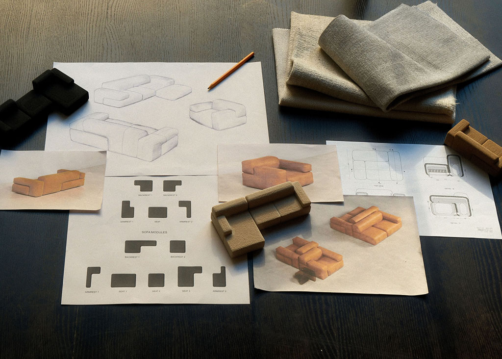
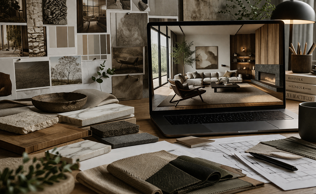
At its best, a mood board is a working hypothesis. It proposes a relationship between colors before anyone has committed to paint or plaster. It puts textures in proximity — the roughness of raw stone against the softness of unbleached linen, the grain of oak beside the cool surface of glass — and tests whether they belong together. It captures a quality of light through reference images: raking and golden, or diffuse and northern and still.
None of this is decorative. Every choice on the board is a proposed design decision. The board argues for a particular emotional register and invites the people around it to agree or push back before anything has been ordered or installed.
Its limitation is spatial. A mood board shows elements, not rooms. It suggests the vocabulary of a design without yet forming sentences. A client looking at a well-assembled board can feel the direction of a project, but they are still being asked to imagine how those references will translate into the actual proportions, light conditions, and spatial relationships of the room being designed. That leap is harder than it looks.
Mood boards often become more useful when paired with interior renderings, because the project starts to move from aesthetic references to a more coherent spatial idea — the textures proposed on the board find actual surfaces, the lighting quality suggested by a photograph begins to behave within real geometry.
Why Material Combinations Need Spatial Context
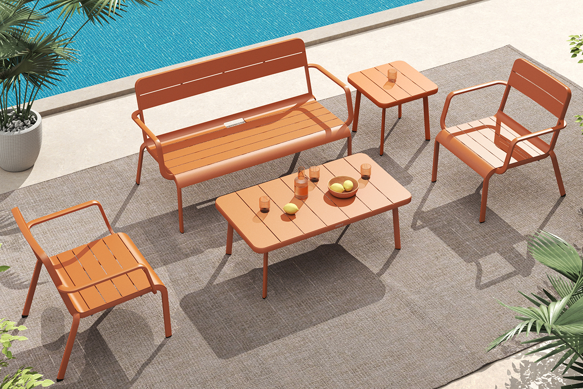
Two materials that look harmonious on a sample board can feel flat together in a room. Two that seem to conflict in isolation can produce something rich and alive at the right scale and proportion. This is not a paradox — it is simply how spatial design works. Materials do not exist in isolation. They exist in relationship to each other, to the room’s volume, and to the light.
Velvet on a sofa reads one way against polished concrete and quite another against wide-plank oak. Marble on a kitchen surface changes its mood entirely depending on whether the surrounding cabinetry is painted or left in raw timber. Linen curtains filter afternoon light differently from heavier fabric, and that difference shapes the room’s atmosphere as much as any deliberate design decision.
What this means in practice: understanding how materials will work together requires seeing them together — in the same volume, under similar lighting, at a scale that reflects actual proportions. A sample board held up in an office is a starting point. The spatial question comes later.
Moving from References to an Actual Room
There is a real distance between a project with a strong mood board and one with a developed spatial concept. Crossing it means translating the emotional intention of the references — the warmth, the quietness, the sensory density — into decisions about how the room is actually organized and experienced.
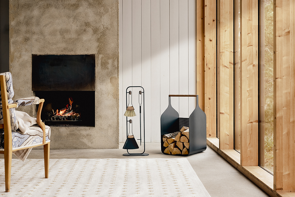
Layout shapes atmosphere more than most people expect. A generous room feels different from an intimate one even when both use identical materials and palette. The position of a focal point — a fireplace surround, a piece of statement furniture, a carefully placed pendant light — reorganizes the entire visual hierarchy of a space. Where natural light enters, and how artificial light supplements it after dark, determines what the room communicates at different hours of the day.
When a concept needs to be shown with greater clarity before execution begins, interior rendering services can help designers communicate atmosphere, materials, and layout more convincingly. The rendering doesn’t replace the mood board — it builds on it. The material references that established the project’s emotional center now occupy real surfaces, real proportions, real light.
The Value of Shared Visual Reference
Interior decisions are hard to reverse. Surface finishes, fitted furniture, structural choices — these are commitments, in terms of both cost and time. The clearer a concept is before execution begins, the more confident those commitments can be made, and the less likely they are to produce surprises.
This matters most in the relationship between designer and client. A client who can see the concept spatially occupies a different position from one who has approved it based on verbal description and individual samples. The former can engage with the design direction meaningfully — they can identify what resonates, articulate what concerns them, and participate in the refinement. The latter is essentially operating on trust alone, which works until it doesn’t.
Visual clarity at the concept stage isn’t about producing finished images for approval. It’s about creating a shared reference that both parties can look at together and use to navigate the decisions ahead. When that reference is specific enough to be discussed rather than imagined, the conversation becomes more productive and the outcome more likely to reflect what the project was originally meant to be.
What Makes a Concept Feel Complete
A successful interior is not simply one where every element has been chosen with care. It is one where every element has been chosen in relation to every other — so that walking into the room produces a single coherent experience rather than the sense of encountering a series of independent decisions.
This coherence comes from continuity. The warmth established by the oak floor should find its echo in the timber detail of the furniture. The lighting quality proposed in the concept should be sustained throughout the room, from the principal sources to the smaller, incidental lights. The material character introduced early in the project — earthy, refined, graphic, sensory — should remain recognizable even in the most minor detail.
A designed room and a decorated room differ on exactly this point. Decoration adds objects to space. Design proposes a language for the space and then speaks it consistently across every surface and decision. The mood board is where the language is first proposed. The visual work that follows — the material development, the spatial exploration, the rendering — is where it is refined and made legible. Together, they are what allow a concept to survive the long journey from first impression to finished room, intact.